Useful Links
Social
Uncover Hidden Property Insights. Visually.
Get a clear view of the UK property market with M0VE’s smart, powerful dashboards.
From street-level insights to postcode trends and national stats, every view helps you spot opportunities, compare performance, and make sharper decisions — all in just a few clicks.
What's on offer?
View 1
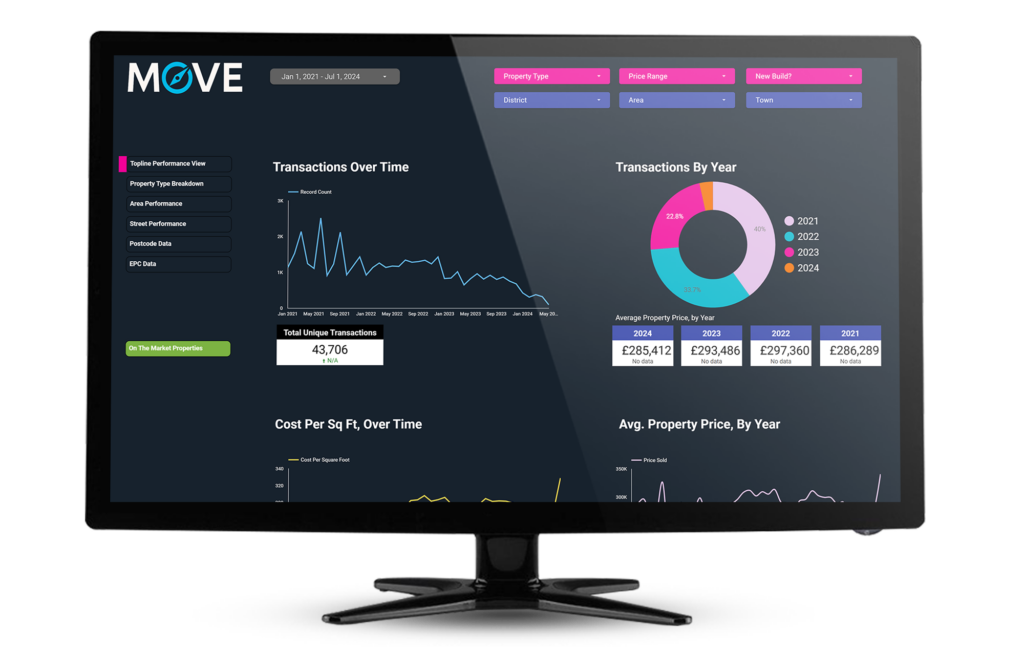
Topline Performance View
Track the market’s movements — month by month, year by year.
This powerful view gives you a detailed look at how the property market has behaved since 2021, using clean, easy-to-read charts that spotlight sales activity, pricing trends, and cost-per-square-foot shifts over time.
What You’ll See:
- 📅 Monthly Transactions: A sharp line graph showing how many homes sold each month — ideal for spotting seasonal patterns or sudden slowdowns.
- 🧩 Yearly Breakdown: A bold donut chart comparing transaction volumes across 2021, 2022, 2023, and 2024.
- 💷 Average Price Tiles: At-a-glance figures showing the average property price for each year since 2021 — a quick way to gauge market growth.
- 📉 Price Per Sq Ft (Trend): A dynamic line chart that shows what buyers have been paying per square foot, month by month — perfect for tracking value shifts.
- 📏 Sq Ft Value by Price Band: A clear bar chart matching average floor size with cost per sq ft across different price brackets — useful for smarter budgeting.
- 📊 Price Range Distribution: A punchy pie chart breaking down what percentage of homes sold fall into each pricing tier.
Use this view to get a clear, data-driven snapshot of market behaviour — whether you’re planning to buy, sell, or just time
View 2
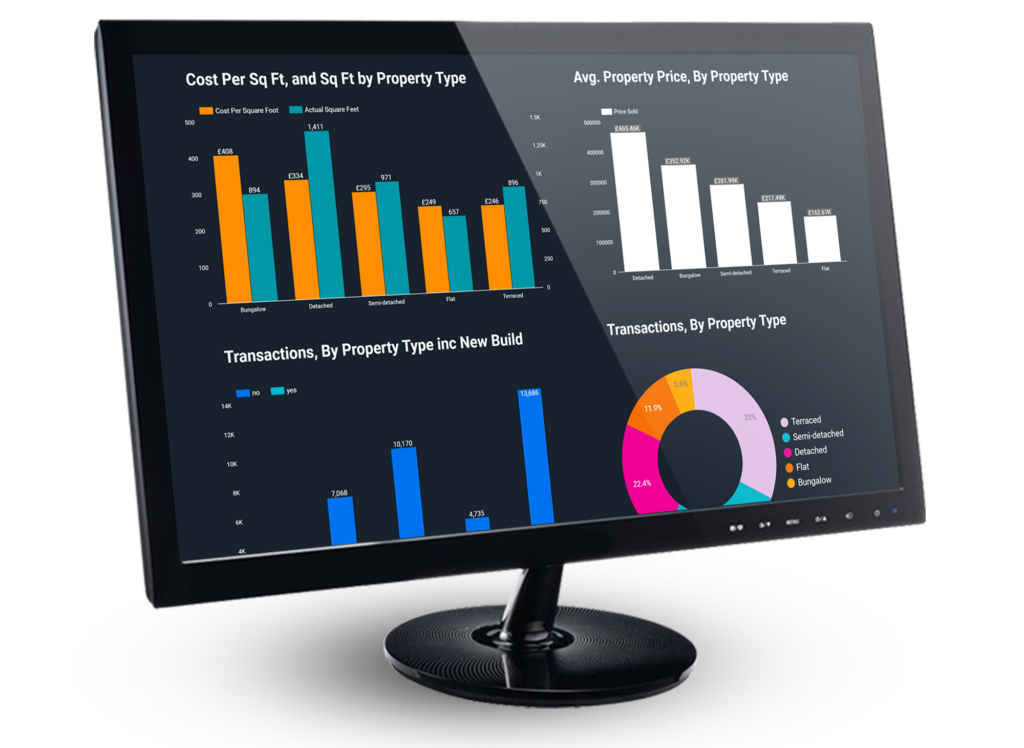
Property Type Breakdown
See how each type of home really performs across the market.
This section breaks down how different property types stack up in terms of price, size, and sales activity — giving you the insights you need whether you’re buying, selling, or investing.
Key Visuals:
- 💷 Cost Per Sq Ft & Size by Property Type: A clear side-by-side bar chart comparing price per square foot and average property size across bungalows, detached, semi-detached, flats, and terraced homes — helping you weigh value against space.
- 📊 Average Property Price by Type: See how average sale prices differ by property type. Detached homes top the list, while flats offer the most affordable entry point.
- 🏗️ Transactions by Property Type (Including New Builds): A stacked bar chart showing sales volume by type, with a split between new builds and existing properties — ideal for spotting demand and development patterns.
- 📈 Total Transactions by Type: A mix of a donut chart and tile summary that shows which types of homes are most popular. Terraced homes lead the pack, followed by semi-detached and flats.
This view helps you make informed, property-specific decisions based on real market activity — not guesswork.
View 3
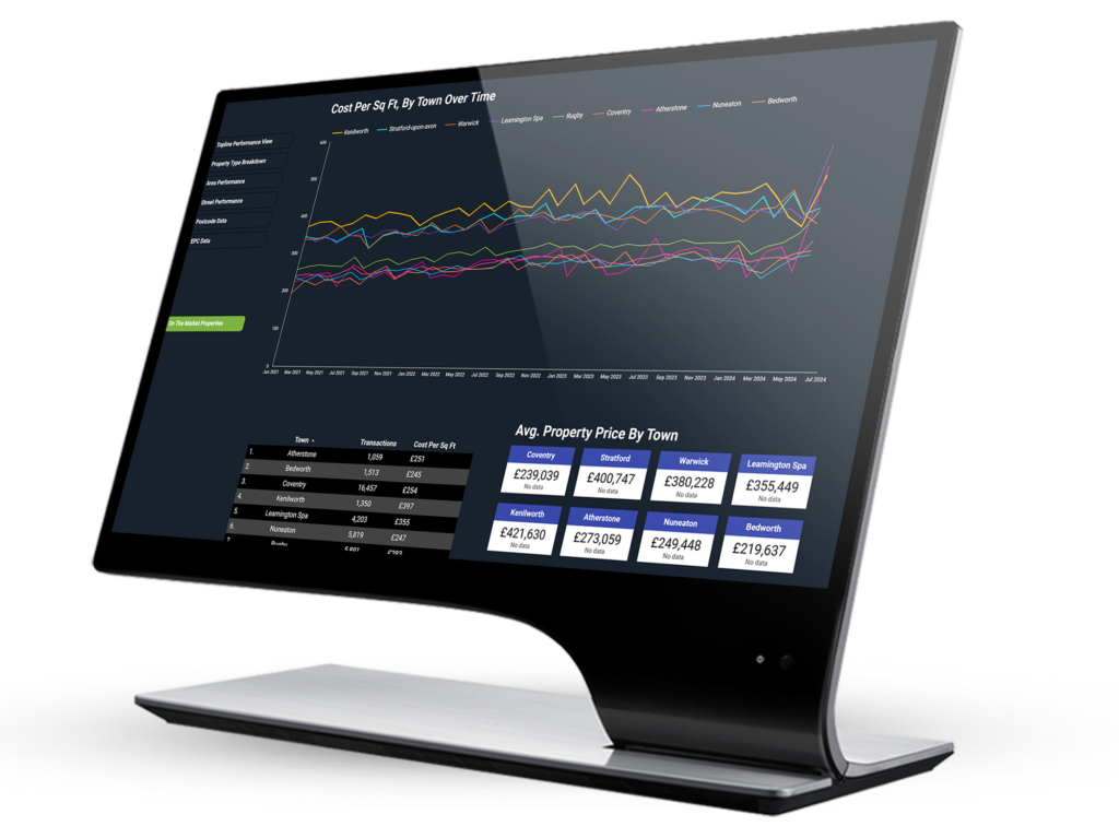
Area Performance
Compare towns, districts, and postcode areas with pinpoint accuracy.
This dashboard uncovers how different locations perform on key property metrics — from cost per square foot to sales volume — making it easier to spot high-value zones and promising investment areas.
What You’ll Learn:
- 📈 Cost Per Sq Ft by Town (Over Time): A dynamic multi-line chart that shows how values have shifted across towns like Warwick, Coventry, and Leamington Spa — perfect for comparing long-term growth trends.
- 🏙️ Town-Level Metrics: A ranked data table featuring total transactions and average cost per square foot for each town, with supporting tiles showing:
- Average property price
- Average cost per sq ft
- CPC (Composite Property Confidence) score
- 🧮 Area-Level Breakdown: A detailed table presenting postcode-specific stats (like CV1, CV2), including:
- Number of transactions
- Average property price
- Average square footage
- Cost per square foot
- 📊 Average Price by Area (Bar Chart): A bold visual comparison of property prices across postcode areas — ideal for spotting both undervalued zones and areas carrying a price premium.
- 📌 Transactions by Property Type & Area: A stacked bar chart revealing which property types dominate in each postcode, helping you understand the housing mix, buyer demand, and turnover across regions.
This view equips you with location-specific insights to help you plan smarter, whether you’re buying, investing, or advising clients.
View 4
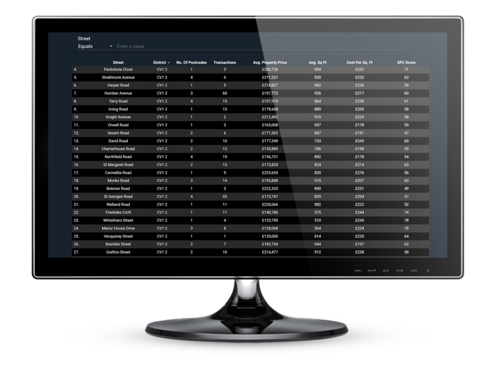
Street-Level Insights
Zoom in and see how individual streets are really performing.
This feature delivers hyper-local data at street level — perfect for buyers, sellers, or agents who want pinpoint pricing accuracy and reliable insights on value, demand, and energy performance.
What You’ll Discover:
- 📍 Every Street, Mapped: Explore thousands of UK streets, each with detailed stats including district, postcode area, and local performance indicators.
- 💷 Avg. Property Price: See the real average sale price on every street — ideal for understanding what homes are actually selling for in the area.
- 📏 Sq Ft & Cost Efficiency: Compare average size and price per square foot to gauge how much space you’re getting for your money, street by street.
- 🔢 Transaction Volumes: Discover how many properties have sold on each road recently — a great way to spot fast-moving or quieter streets.
- 🌱 EPC Score: Check the average energy performance for any street. It’s a smart way to factor in long-term affordability and eco-value.
Whether you’re searching for undervalued roads, analysing a postcode in detail, or helping clients price with confidence, this tool delivers unmatched street-level clarity.
Some of the Other Dashboards you can Unlock Include:

Postcode Data

EPC Data

National Data
Ready to see the bigger picture?
Explore our Data Visualisation Tool to uncover trends, hotspots, and untapped opportunities—street by street. No jargon, no guesswork, just crystal-clear insights drawn from real-time property data.
Start ExploringView our Other Features

Find Hottest Properties
Spot undervalued deals in any given area ℹ️ M0VE scans live listings from OnTheMarket.com and matches them against adjusted historical sales data. Properties listed below their expected value are flagged instantly, making it ideal for bargain hunters, investors, and first-time buyers alike.
➔ View Feature
Property Negotiator Tool
Take the guesswork out of making an offer. ℹ️ With data on local price trends, EPC premiums, and subtypes, users are armed with facts that can support a lower bid or challenge inflated pricing. It’s a powerful way to negotiate with confidence.
➔ View Feature
Property Valuation Tool
Access the UK’s most accurate valuation tool ℹ️ Users input square footage, property type, and build status into our bespoke widget. Our platform returns a data-backed estimate with a certainty score, using refined data from the Land Registry and EPCs. It’s a precise tool for avoiding overpayment and spotting mispriced homes.
➔ View Feature
Data Visualisation Tool
Visualise UK market data with interactive charts ℹ️ Interactive dashboards turn complicated trends into clear, visual insights. Users can filter by region, property type, price band, or street for targeted, custom research without the overload.
➔ View Feature
Dream Property Finder
Find the perfect home that matches your budget and lifestyle ℹ️ Users complete a smart, lifestyle-based form that covers budget, location, property types, and household needs. M0VE then matches them with areas and streets that actually fit their life.
➔ View Feature
House Price Intelligence
Get in-depth stats for any street in the UK ℹ️ Each street comes with its own dedicated data page, showcasing historic prices, turnover, EPC ratings, and nearby comparisons. Instant valuation widgets let users get tailored estimates in seconds.
➔ View Feature
Relocation Adviser
Relocate smarter with side-by-side area comparisons ℹ️ Relocation Advisor compares key stats between areas - like Manchester vs Bristol - showing how prices, energy scores, schools, and buyer demand stack up. It’s ideal for movers planning a strategic shift.
➔ View Feature
Smart Alerts System
Get smarter alerts that go way beyond new listings ℹ️ Smart Alerts let you track market shifts that matter. From undervalued listings to EPC changes or postcode performance battles, you’ll be the first to know. Fully customisable and pairs perfectly with the Hot Deals system.
➔ View Feature
AI Chat Assistant
Chat with AI trained on real property data ℹ️ The AI Chat Assistant answers real questions using your live data. Ask about area trends, specific listings, or smart investment moves. It’s like having a local expert on call — 24/7.
➔ View Feature
Unlock the Full Power of M0VE
Get hyper-accurate property valuations, access premium street-level insights, and discover exclusive hot deals — only with a M0VE Pro plan.
View Details Already have Pro? Log in here
